
Originally published: 4 April 2024
Last updated: May 2026
Quick answer:
The main secrets to website conversions are clarity, simplicity, trust, strong calls to action and good page performance. Your website should quickly explain what you do, who you help and why a visitor should choose you. It should make enquiries easy with clear navigation, short forms and visible contact options. Trust signals such as reviews, case studies, accreditations and clear contact details help reduce hesitation. Calls to action should match what the visitor is ready to do, such as requesting a quote or booking a call. When these elements support your Website SEO strategy, you can turn more existing visitors into enquiries, bookings and customers.
Intro:
Getting traffic to your website is only part of the job. If visitors arrive but do not enquire, book, call, or buy, your website is not pulling its weight commercially. That is why understanding the real secrets to website conversions matters so much for UK businesses.
A good looking website is not enough. Strong website conversions come from clear messaging, a smooth user journey, trust-building content, well-placed calls to action, and pages that support the decision-making process. When these elements work together, your website conversion rate improves and your site becomes a more reliable source of leads and sales.
In this article, we will look at five practical ways to turn visitors into customers. These are not vague design tips. They are specific conversion improvements that can help increase website enquiries, improve website sales performance, and support better return from your marketing.

Why website conversions matter for sales growth
What a website conversion means for UK businesses
A website conversion is any action that moves a visitor closer to becoming a customer. For one business, that might be a completed contact form. For another, it could be a phone call, a booking request, a quote request, a product purchase, or a newsletter sign-up that feeds into future sales.
For UK service businesses, common conversions include:
- Contact form submissions
- Phone calls from the website
- Appointment bookings
- Quote requests
- Downloads of a brochure or guide
- Email enquiries
For ecommerce businesses, conversions often include:
- Completed purchases
- Added items to basket
- Started checkout
- Account creation
- Email sign-ups for future offers
The key point is this. A conversion is not just a website metric. It is a commercial action with real value. If your website attracts 1,000 visitors a month but only a handful take action, there is likely a gap between traffic and results. Improving that gap is where conversion rate optimisation becomes valuable.
Many businesses focus heavily on getting more traffic, but often the faster win is improving what happens after the click. If your current website conversion rate is low, even small improvements can produce more leads and sales without increasing your ad spend or SEO budget.
How better conversions improve leads, enquiries, and revenue
Better conversions mean more value from the traffic you already have. That can have a direct effect on sales growth.
For example, if your website gets 2,000 monthly visitors and converts at 1%, that gives you 20 enquiries. If you improve the conversion rate to 2%, you double that to 40 enquiries without needing more traffic. If your sales process converts a healthy percentage of those enquiries into customers, the revenue impact can be significant.
This is why website sales performance should be looked at as a full journey, not just a traffic number. Better conversions can help you:
- Increase website enquiries from existing traffic
- Lower the cost per lead from paid campaigns
- Generate more calls and bookings
- Improve return on SEO and content marketing
- Turn visitors into customers more consistently
- Support sales teams with stronger quality leads
If you want a broader strategy to improve your website SEO, our Website SEO service page explains how better search visibility and stronger on-page optimisation work together to support more conversions. You can learn more here: improve your website SEO.

Secret 1: Make your value proposition instantly clear
One of the biggest reasons websites fail to convert is simple. Visitors cannot quickly work out what the business does, who it helps, or why they should choose it.
When someone lands on your website, you have only a few seconds to answer key questions in their mind. If your message is vague, overcomplicated, or buried too far down the page, people leave.
How to explain what you do and who you help
A strong value proposition should make your offer obvious. It should tell visitors:
- What you do
- Who you do it for
- What result they can expect
- Why your business is a good choice
For example, compare these two homepage messages:
“Delivering innovative digital excellence for ambitious brands”
Against:
“SEO and website marketing for UK businesses that want more enquiries, better rankings, and stronger online sales”
The second version is clearer, more specific, and more commercially relevant. It helps the visitor self-identify quickly.
To improve your value proposition:
- Use plain English
- Be specific about your service or product
- Mention your target audience where relevant
- Focus on outcomes, not just features
- Avoid generic claims that any competitor could make
If you are a local service business, say where you work and what type of clients you help. If you are a B2B company, make it clear which sectors or business types you serve. If you offer a specialist service, say so early.
A good value proposition reduces confusion and gives visitors confidence that they are in the right place. That is one of the most important secrets to website conversions because clarity is often the first barrier to action.
Where to place your message for maximum impact
Even a strong message will underperform if it is hidden. Your value proposition needs to appear where visitors will see it immediately.
Priority locations include:
- The main headline at the top of the homepage
- The opening section of key service pages
- Landing pages used for paid traffic
- The first visible content on mobile
- Supporting text near your main call to action
The top section of a page should not be wasted on vague slogans or oversized images with little context. It should do a job. In most cases, that means combining a clear headline, a short supporting explanation, and a visible next step such as “Request a quote”, “Book a call”, or “See our services”.
For example, a page for a commercial cleaning company might open with:
“Commercial cleaning services for offices, schools, and healthcare sites across Greater Manchester”
Then support that with:
“Reliable, fully insured cleaning teams with flexible contracts and fast response times”
Then include a call to action:
“Request a site visit”
That is clear, practical, and conversion-focused.
Secret 2: Reduce friction in the customer journey
Many websites lose conversions not because the offer is weak, but because the journey is harder than it needs to be. Friction is anything that slows people down, creates uncertainty, or makes action feel like effort.
If a visitor wants to enquire but cannot find the right page, has to complete a long form, or gets distracted by too many options, the chance of conversion drops.
Simplify navigation, forms, and page structure
A website should guide visitors towards action, not force them to work for it. Simplicity improves usability and helps conversion rate optimisation efforts deliver better results.
Start with navigation. Ask yourself:
- Can visitors find your main services quickly?
- Is the menu clear and logical?
- Are there too many choices?
- Do key pages have obvious routes to contact or enquire?
For many businesses, a simpler menu performs better than a complex one. Group related services clearly and avoid cluttering the navigation with low-priority pages.
Next, review your forms. Long forms can be useful for qualification, but they often reduce response rates if used too early. Only ask for information you genuinely need at that stage.
A quote form asking for name, email, phone, company, budget, timeline, project details, referral source, and several dropdown selections may feel excessive. In many cases, a shorter form with name, contact details, and a brief message will increase website enquiries.
Page structure matters too. Visitors should be able to scan a page and understand:
- What the page is about
- Why it matters to them
- What proof supports your claims
- What they should do next
Use clear sections, strong headings, concise paragraphs, and visible calls to action. Avoid walls of text, confusing layouts, and pages that try to say too much at once.
Remove distractions that stop visitors taking action
Distractions are often overlooked, but they can quietly damage website conversions. Common examples include:
- Too many calls to action on one page
- Pop-ups that interrupt important content
- Auto-playing videos
- Irrelevant links pulling users away
- Stock imagery that adds visual noise without adding value
- Overdesigned pages that make scanning difficult
Every page should have a primary goal. If a service page is meant to generate enquiries, its design and content should support that goal. If the page also pushes visitors towards blog posts, social media, unrelated downloads, and multiple competing offers, the path becomes weaker.
A practical way to review this is to ask: what is the one main action I want a visitor to take on this page?
Then make that action more prominent than everything else.
This is especially important on mobile. Smaller screens make clutter more damaging. Buttons need to be easy to tap, text needs to be readable, and contact options need to be obvious. A mobile visitor should not have to pinch, zoom, or hunt around to take the next step.

Secret 3: Build trust with proof and reassurance
People rarely convert on confidence alone. They want reassurance that your business is credible, capable, and safe to buy from. Trust is one of the strongest influences on whether a visitor takes action.
If your website makes claims but offers little proof, visitors may hesitate. If it shows evidence, credibility, and reassurance at the right moments, conversion rates usually improve.
Use testimonials, reviews, case studies, and accreditations
Trust signals should support your sales message, not sit in isolation on a forgotten page. The most effective websites place proof close to decision points.
Useful trust-building content includes:
- Client testimonials
- Google reviews
- Case studies with measurable outcomes
- Industry accreditations
- Memberships and certifications
- Recognisable client logos
- Awards where relevant
- Years of experience
- Clear business location and contact details
The best testimonials are specific. “Great service” is better than nothing, but “Steve helped us increase organic enquiries by 42% in six months” is far more persuasive. Specificity makes trust more believable.
Case studies are especially valuable for service businesses. They help potential customers see how you solve real problems. A strong case study should explain:
- The client’s challenge
- What you did
- The result
- Why it mattered commercially
For example, if you helped a business improve its website conversion rate, show the before and after picture. Did enquiries rise? Did bookings increase? Did bounce rates fall? Commercial outcomes matter.
Accreditations and certifications also help, particularly in sectors where compliance, safety, or technical standards influence buying decisions. If you are regulated, insured, certified, or approved by a recognised body, make that visible.
Add trust signals that support buying decisions
Trust is not only about testimonials. It is also about reducing perceived risk.
Visitors often ask themselves questions such as:
- Will this company do what it promises?
- Can I trust them with my details?
- Will I get a response?
- Are they established?
- Do they understand businesses like mine?
You can answer these questions with practical trust signals across your site, such as:
- A professional About page with real team information
- Clear contact details including phone number and location
- Privacy and data reassurance near forms
- Transparent pricing information where appropriate
- Delivery, returns, or service process details
- FAQs that address common concerns
- Before and after examples
- Response time expectations
For example, adding a short line near a contact form such as “We usually respond within one working day” can increase confidence. So can a note saying “Your details will only be used to respond to your enquiry”.
Trust signals should appear where hesitation is likely. On service pages, near forms, in the footer, on checkout pages, and around key calls to action. They help turn interest into action by making the next step feel safer.
Secret 4: Strengthen calls to action and conversion paths
A surprising number of websites fail to ask clearly for the next step. Visitors may be interested, but if the call to action is weak, vague, or poorly timed, they often do nothing.
Strong calls to action are not aggressive. They are clear, relevant, and aligned with user intent.
Write clearer CTAs that match user intent
A call to action should reflect what the visitor is ready to do. Someone at the early research stage may not be ready to “Buy now”, but they may be willing to “Get a free quote”, “Book a consultation”, or “See pricing”.
Generic buttons such as “Submit” or “Learn more” often underperform because they do not communicate value. Better CTAs are more specific and outcome-focused.
Examples include:
- Request a quote
- Book your free consultation
- Speak to our team
- Get pricing
- Start your SEO review
- Download the brochure
- Arrange a demo
The right CTA depends on the page and the audience. A homepage may need a softer CTA for first-time visitors. A service page may need a stronger enquiry CTA. A landing page for paid traffic may need one focused action with minimal distractions.
It also helps to support the CTA with a short line that reduces uncertainty. For example:
- “Book a free 20-minute call to discuss your website performance”
- “Request a quote and we will respond within one working day”
- “Get a tailored proposal for your business”
This gives context and makes the action feel more worthwhile.
To improve CTA performance:
- Use action-led wording
- Make the benefit clear
- Place CTAs above the fold and throughout longer pages
- Match the CTA to the visitor’s stage of intent
- Avoid too many competing CTA options
- Test button text and placement over time
Create landing pages that guide visitors to enquire or buy
A landing page should be built around a single conversion goal. Whether that goal is an enquiry, booking, or sale, the page should guide visitors towards it with minimal friction.
Strong landing pages usually include:
- A clear headline linked to the visitor’s need
- A concise explanation of the offer
- Relevant benefits
- Trust signals
- A focused CTA
- Supporting FAQs or reassurance
- A clean layout with no unnecessary exits
For example, if you run Google Ads for “emergency electrician Manchester”, the landing page should directly address that need. It should not send traffic to a generic homepage and expect visitors to figure things out.
The page should confirm relevance immediately, explain availability or response times, show trust signals such as reviews or certifications, and make it easy to call or request help.
The same principle applies to service pages for SEO, web design, legal services, healthcare, trades, and professional services. Conversion paths work best when the content matches the user’s intent and removes doubt at each step.

Secret 5: Improve page performance and user experience
The final of these secrets to website conversions is often the most technical, but it has a direct commercial impact. If your website is slow, awkward, or unreliable, visitors will leave before they convert.
A strong user experience supports every other conversion improvement. Even the best messaging and trust signals will struggle if the page itself performs poorly.
Speed, mobile usability, and technical performance affect conversions
Page speed matters because delays reduce patience and confidence. If a page takes too long to load, especially on mobile, many users will leave before they even see your offer.
Slow websites can damage:
- Lead generation
- Online sales
- Paid campaign performance
- SEO visibility
- User trust
Common causes of poor performance include oversized images, bloated code, too many scripts, poor hosting, and unnecessary design effects.
Mobile usability is equally important. A large share of UK website traffic now comes from mobile devices, yet many business websites still offer a weaker mobile experience than desktop. Common issues include:
- Buttons too small to tap
- Text too small to read
- Forms difficult to complete
- Important content hidden too far down
- Sticky elements blocking the screen
- Poor spacing and layout shifts
Technical issues also affect conversion paths. Broken forms, missing thank you pages, faulty tracking, and click-to-call buttons that do not work can all cost you leads.
Review your website regularly from a user perspective. Test key pages on different devices. Complete your own forms. Check how quickly pages load. Make sure every important conversion action works as intended.
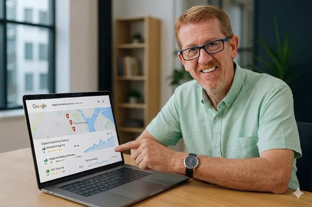
H3: Use data to identify where conversions are being lost
Conversion improvements should not rely on guesswork alone. Data helps you find where users are dropping off and which pages need attention first.
Useful sources of insight include:
- Google Analytics
- Google Search Console
- Heatmaps
- Session recordings
- Form tracking
- Call tracking
- CRM data
- Sales team feedback
Look for patterns such as:
- Pages with high traffic but low conversion rates
- Landing pages with high bounce rates
- Forms that are started but not completed
- Mobile pages with weaker performance than desktop
- Traffic sources that bring visitors but few enquiries
For example, if a service page gets strong organic traffic but very few enquiries, the issue may be weak messaging, poor CTA placement, lack of trust signals, or a mismatch between search intent and page content.
If users reach your contact page but do not submit the form, the form may be too long, unclear, or lacking reassurance.
This is where conversion rate optimisation becomes practical rather than theoretical. You identify the barrier, improve the page, and measure the result.
Small changes can make a meaningful difference. A clearer headline, shorter form, stronger testimonial, faster load time, or better CTA can all contribute to improved website sales performance.
The most effective websites are rarely built perfectly from day one. They improve through testing, observation, and refinement.
The secrets to website conversions are not really secrets in the sense of being hidden tricks. They are proven principles applied properly. Make your value proposition clear. Reduce friction. Build trust. Strengthen calls to action. Improve performance and user experience.
For UK businesses, these changes can lead to more enquiries, more bookings, and more sales from the traffic you already have. That makes your website more than an online brochure. It becomes a working sales tool.
If your current site is attracting visitors but not generating enough commercial results, now is the time to review what is getting in the way. The businesses that turn visitors into customers most effectively are usually the ones that make the journey clearer, easier, and more convincing.
If you want help applying these secrets to website conversions to your own site, Steve Welsh Marketing can help you identify the barriers, improve key pages, and build a website that supports stronger sales growth. Get in touch to discuss how your website can generate more enquiries and better results.
If you want a broader strategy to improve your website SEO, our Website SEO service page explains how better search visibility and stronger on-page optimisation work together to support more conversions.
FAQs
-
What are the main secrets to website conversions?
The main secrets to website conversions are a clear value proposition, a simple user journey, visible trust signals, strong calls to action and fast, reliable pages. These elements help visitors understand your offer and take the next step with confidence.
-
How can I increase website enquiries without getting more traffic?
You can increase website enquiries by improving what happens after visitors arrive. Make your message clearer, shorten forms, place calls to action where people can see them, add proof near decision points and check that contact forms, phone links and booking tools work properly.
-
Why is trust important for website conversion rate?
Trust affects whether a visitor feels safe enough to enquire, book or buy. Reviews, testimonials, case studies, accreditations, clear contact details and privacy reassurance all help reduce doubt and support better conversion rate optimisation.
-
How do calls to action affect website sales performance?
Calls to action guide visitors towards the next sensible step. Clear wording, such as Request a quote, Book a consultation or Speak to our team is more useful than vague button text. The best calls to action match the visitor’s intent and are easy to find on desktop and mobile.
-
How does Website SEO support better conversions?
Website SEO helps attract relevant visitors, while conversion improvements help more of those visitors take action. When search visibility, page content, user experience and calls to action work together, your website is more likely to generate useful enquiries and sales opportunities.


")